This is a short review of HealthCare.gov from a perspective of a Web Designer.
My opinion is based on 20 years of in the trenches web design work. This is not a political post and this is not a political blog. This is one man’s understanding of technology, how it should work, and how websites should benefit users. And most importantly, this is about security.
Should the federal government be responsible for the health care of its citizens. Should a government by the people and for the people provide healthcare. Whatever your opinions may be these political questions will not be answered in this blog post.
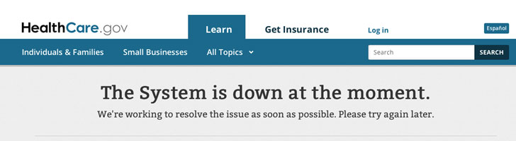
Healthcare.gov was launched in October. The expectations were not high. In fact, people were expecting glitches. However what has transpired cannot be described as a glitch. What has transpired could be the worst rollout of a website in internet history.
The good part about the website is that it is aesthetically pleasing. So it’s pretty in other words. The interface design isn’t that bad. There’s a lot of issues with this website, I’m going to discuss the most egregious.
3 Major Problems
1. Tactical strategy – This is just one of the tactics I’ll discuss. The tactical strategy is fraught with opportunity for unvetted resources to do bad things with your information. In other words, just the way the system is set up puts your information at risk. Let’s start with what they call “navigators”. These navigators are supposed to help you get health care offline that you currently don’t have or aren’t happy with. No vetting has taken place with regards to navigators. They can literally have a criminal record and you wouldn’t know about it. There is no requirement for them to have a license nor are they required to go through any rigorous training. This is a big privacy risk for you and your family.
2. Security – Security these days is one of the most overlooked aspects of web design. Is it no surprise that this website completely forgets it as well. I’m not going to detail because there’s a lot that has been said or written about security that you could find for yourself online (Read this, this). But, according to what I know this website is not secure to the level that you or I are used to or expect. Think about that for a moment. This website costed taxpayers roughly $300 million. Where’s the encryption? Where is the security? Are you serious? You need more than an SSL to be secure and PCI compliant. CMS the contractor hired to build this mess admitted that they didn’t even properly test for security. The most important question, is healthcare.gov PCI compliant? No one knows. Now that’s scary.
“It’s not so much one flaw as what else might be lacking there,” said Matthew Prince, the CEO of CloudFlare, a company focused on website performance [and security]. “It’s embarrassing in the short term. But the long-term risk is if that same lack of engineering carried through and did not properly secure the site, then it may be possible to obtain data from the site that customers are trusting with it.” Read more: Full Story
3. User Experience – This one’s easy. Healthcare.gov is a train wreck of a user experience. It is so bad that a handful of people are able to sign up everyday according to some reports. That is not to say that the interface is causing all these issues. On the contrary, what’s causing all these issues are the underlying security problems, how the code is written, the authentication pieces of the software, poorly written code, and the 500 million lines of code that aren’t easily patched. By the way, 500 million lines of code is more code than Windows XP. Bloat anyone?
Signing up risks your identity being stolen or compromising your privacy. There’s a report that an applicants info just this past week was communicated to another applicant. This is a perfect example of bad strategy and bad implementation. Should you feel compelled to sign up on healthcare.gov, please also sign up for LifeLock.
This website while pretty isn’t ready for prime time so buyer beware.

Simon is a Product Designer and Front End Dev with over 20 years of experience. He started as a graphic designer and illustrator coding his first website in 1996. He has worked with brands like Publix, Microsoft, and Discovery Channel.