Understanding Design Systems
Design systems have become an integral part of the digital product development process. They provide a comprehensive framework that streamlines the design and development workflow, ensuring consistency, efficiency, and improved user experiences.
Design systems have evolved to address the challenges faced by design and development teams in creating and maintaining consistent designs across various platforms and devices. They offer a centralized repository of reusable components, guidelines, and resources that define the visual and interactive aspects of a digital product.
The Basics of Design Systems
A design system is a collection of reusable components, guidelines, and resources that define the visual and interactive aspects of a digital product. It includes UI patterns, style guides, design principles, and other key components that guide the creation and maintenance of consistent designs across various platforms and devices.
At its core, a design system serves as a single source of truth for design decisions, enabling teams to work collaboratively, reduce redundancy, and maintain design consistency throughout the product lifecycle.
UI patterns are an essential part of a design system. They provide a set of pre-defined user interface elements and interactions that can be used consistently across different screens and devices. These patterns help designers and developers create intuitive and familiar experiences for users.
Style guides, another crucial component of a design system, establish the visual language of a product. They define the typography, color palette, iconography, and other visual elements that contribute to the overall look and feel of the product. By adhering to the style guide, designers and developers can ensure visual consistency and brand identity.
Design principles, on the other hand, guide the decision-making process behind the design system. They outline the core values and goals that drive the creation of the components and patterns within the system. These principles help maintain a cohesive and purposeful design language throughout the product.
Importance of Design Systems in Digital Products
Implementing a design system offers numerous benefits for digital product development. Firstly, it helps create a unified and cohesive user experience across different touchpoints, enhancing brand recognition and perception.
Design systems also improve the efficiency of the design and development process. By providing pre-defined UI patterns, style guides, and design principles, teams can save time and effort in creating and iterating on designs. This allows them to focus more on solving user problems and delivering impactful experiences.
Moreover, design systems promote collaboration and consistency within teams and across departments. They establish a shared language and understanding of design decisions, reducing miscommunication and iterations. This ensures that everyone involved in the design and development process is aligned and working towards a common goal.
Furthermore, design systems contribute to scalability and scalability in product development. As digital products evolve and grow, design systems provide a scalable framework that can accommodate new features, platforms, and devices. This scalability ensures that the product remains consistent and cohesive, even as it expands and adapts to changing user needs.
In conclusion, design systems play a crucial role in the digital product development process. They provide a comprehensive framework that promotes consistency, efficiency, and collaboration. By implementing a design system, teams can create unified user experiences, save time and effort, and ensure that everyone is aligned towards a common goal. With their scalability and adaptability, design systems are an essential tool for creating and maintaining successful digital products.
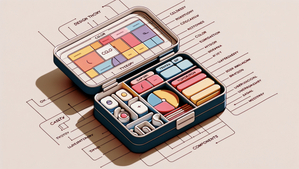
Key Components of a Design System
A well-structured design system consists of several key components that work together to define the product’s visual and interactive elements. These components include user interface (UI) patterns, style guides and visual language, and design principles and guidelines.
User Interface (UI) Patterns
UI patterns are reusable design solutions that solve common design problems. They encompass the layout, functionality, and interaction patterns found within a digital product. By defining a set of UI patterns in a design system, teams can efficiently create consistent and intuitive interfaces across different screens and platforms.
For example, one common UI pattern is the navigation menu. A design system may provide guidelines on how to structure and style the navigation menu, ensuring that it is easy to use and visually appealing. Another UI pattern could be a form input field, with guidelines on how to design and validate the input to enhance the user experience.
By having a library of UI patterns, designers and developers can save time and effort by reusing existing solutions instead of starting from scratch for each new project. This not only speeds up the design and development process but also maintains consistency throughout the product.
Style Guides and Visual Language
Style guides establish the visual language and aesthetics of a digital product. They define the color palette, typography, iconography, spacing, and other visual elements that contribute to the overall look and feel of the product. By providing guidelines for visual consistency, style guides enable designers and developers to create cohesive and visually appealing interfaces.
For instance, a style guide may specify the primary and secondary colors to be used throughout the product, along with their corresponding hex codes. It may also define the font families and sizes for headings, paragraphs, and other text elements. Additionally, the style guide may include guidelines on how to use icons and illustrations consistently, ensuring a unified visual language.
By following the style guide, designers and developers can ensure that their work aligns with the brand’s identity and maintains a consistent visual experience for users. This not only enhances the overall aesthetic appeal but also reinforces brand recognition and trust.
Design Principles and Guidelines
Design principles and guidelines are the foundation of a design system. They outline the core values and philosophies that guide design decisions. These principles help ensure that designs are aligned with the brand’s vision and objectives. Guidelines provide specific instructions on how to apply these principles in different contexts, helping maintain consistency and cohesiveness throughout the product.
For example, a design principle could be “simplicity” – emphasizing the importance of keeping designs clean and uncluttered. The corresponding guideline may suggest using ample white space, minimizing the number of elements on a page, and avoiding unnecessary complexity. Another design principle could be “accessibility,” with guidelines on how to design for users with disabilities, such as providing alternative text for images and ensuring proper color contrast.
By adhering to design principles and guidelines, designers can create products that are not only visually appealing but also functional and user-friendly. These principles and guidelines serve as a compass, ensuring that design decisions are consistent and aligned with the overall vision of the product.
Building Your Own Design System
Creating a design system tailored to your organization’s needs can seem like a daunting task. However, by following a systematic approach and leveraging the right tools and resources, you can build a robust design system that empowers your team and elevates your digital products.
Steps to Create a Design System
- Research and analyze existing design patterns and best practices to inform your system’s foundation.
- Define your product’s visual language, including color palettes, typography, iconography, and other key visual elements.
- Establish a set of UI patterns and interaction guidelines that address common design challenges and align with your product’s goals.
- Create a comprehensive style guide that documents the usage and implementation of your design elements.
- Iterate and refine your design system based on user feedback and evolving design trends.
Tools and Resources for Design System Creation
Several tools and resources can assist you in building and maintaining your design system effectively. Design collaboration tools like Figma and Sketch enable multiple team members to work collaboratively on design files and maintain version control. Additionally, documentation platforms such as Zeplin or InVision DSM help create organized style guides and provide developers with easy access to design assets and specifications.
Implementing a Design System
Once you have built your design system, it is crucial to integrate it seamlessly into your workflow to maximize its benefits.
Integrating the Design System into Your Workflow
Ensure that your design system is easily accessible to all team members involved in the product development process. Collaborate closely with developers to incorporate the design system’s components and guidelines directly into their workflows. This integration fosters the adoption of the design system across different stages of development, from prototyping to implementation.
Maintaining and Updating Your Design System
A design system should evolve alongside your product and organization. Regularly review and update your design system to reflect changes in user needs, technology advancements, and design trends. Collect feedback from users and stakeholders to identify areas that require improvement or expansion. This iterative process ensures that your design system remains relevant, effective, and aligned with your goals.
Overcoming Common Challenges in Design Systems
While design systems offer numerous benefits, they can also present challenges during implementation and adoption.
Design System Adoption Issues
Design system adoption may face resistance from some team members who are accustomed to their own design workflows or reluctant to change. To overcome this challenge, provide comprehensive training and education on the benefits and value of the design system. Show real-life examples of increased productivity and improved design consistency to encourage adoption and address any initial skepticism.
Ensuring Consistency in Design Systems
Maintaining consistency across a large and diverse design system can be challenging. Regularly review and update your style guides and documentation to reflect changes or additions to the design system. Establish clear communication channels and guidelines for designers and developers to provide feedback and contribute to the ongoing improvement of the design system.
In conclusion, design systems play a vital role in streamlining the design and development process, ensuring consistency, and creating impactful digital products. By understanding the basics of design systems, recognizing their key components, and implementing best practices, organizations can unlock the full potential of their design teams and deliver exceptional user experiences. Embrace the power of design systems and embark on a journey of enhanced efficiency, collaboration, and success in the digital product landscape.