PBS’s Daniel Tiger
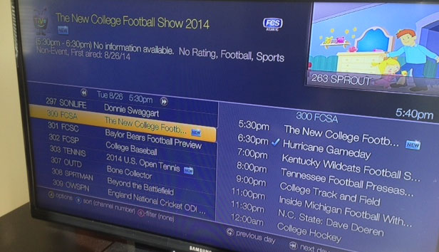
TiVo has been a great addition to my family’s entertainment center for about 2 years now. Especially being able to record the all important Daniel Tiger episodes for my 2 year old. Yet, just recently TiVo rolled out “improvements” that make the menu very hard to read from normal distances.
First of all, typography is 95% of a design. So when you make 95% of your design hard to read the experience is a lesser one.
There’s a big problem when a company the size of TiVo ships an update with a font so thin you would think they were selling Calvin Klein cologne. But alas, no fru fru smell here just Dad (that’s me) trying to squint my way into a good UX.
Typography is part of design that we can always improve upon. And I am not trying to sound like a design snob or anything of the sort. I am keenly aware that being an artist is a journey. I consider good typography art on top of good UI.

My eyes, they burn.
It feels like TiVo was going for the flat look and that’s cool, but when users with large screens are paces away from the screen it’s simply not legible, ironically neither is the highlighted media.
Can you read the highlighted TV episode? Yeah, neither can I. My wife can’t read it either and my child doesn’t really care about the finer point of typography principles. So that’s 66% percent of the users in our house.
I’m sure there’s some way to fix this. Uga muga!


