This is a brief overview of Grid System and why this matters.
 What is a Grid System?
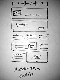
Grid Systems were originally used in print design to create layouts. So for example, if you had a magazine spread to create you would sketch it out in a grid and use that grid system as your guide. Then when you turn that sketch into a digitized comp you still stay within that grid. With the rise of the computer and later the internet Grid Systems simply adapted to technology. As well, taking FlexGrid CSS as an example grid systems are now embedded in code we use every day by default.
The Rules
The rules of a grid system are that you the designer are staying (for the most part) within certain demarcated boundaries in order to have a design that is both legible and engaging. Order drives transactions online and having a messy page is chaos. As a result boundaries would align itself as a whole in the design.
 Breaking the Rules
Once you understand the rules of any grid system or design principle for that matter you can break rules. You can create a 4 column grid and then break the grid to make the design layout more engaging.
Why do we need Grid Systems?
Grid Systems add order in an otherwise chaotic design world. It should be noted that not using a grid doesn’t guarantee poor design or failure, yet we know using grid systems can help your designs and help your code too.
Always Learning
It is important that designers know about everything in general terms (seriously). When you have clients that can be as varied as the colors of a rainbow, it is critical that you are prepared to deliver design by understanding that specific client’s needs and business. A grid system is a cog in that design process.


