Summary:
IBM has created an awesome design system that puts the power in your hands to build amazing digital products and experiences. The Carbon Design System is centered around core principles and elements like colors, typefaces, layouts, and icons so you can create a consistent visual language across products. It also provides components for user interfaces such as buttons, forms, tables/grids – plus patterns of all kinds! With scalability & flexibility built-in it’s easy to customize this robust toolset specifically for each product or team; no two projects have ever looked the same thanks to Carbon! We are going to focus this post on things that make Carbon design system different. (https://carbondesignsystem.com)
Carbon design system is split up into the following sections:
- All about Carbon
- Case studies
- What’s happening Designing
- Developing
- Contributing
- Migrating
- Guidelines
- Components
- Patterns
- Community assets Data visualization Help
- GitHub
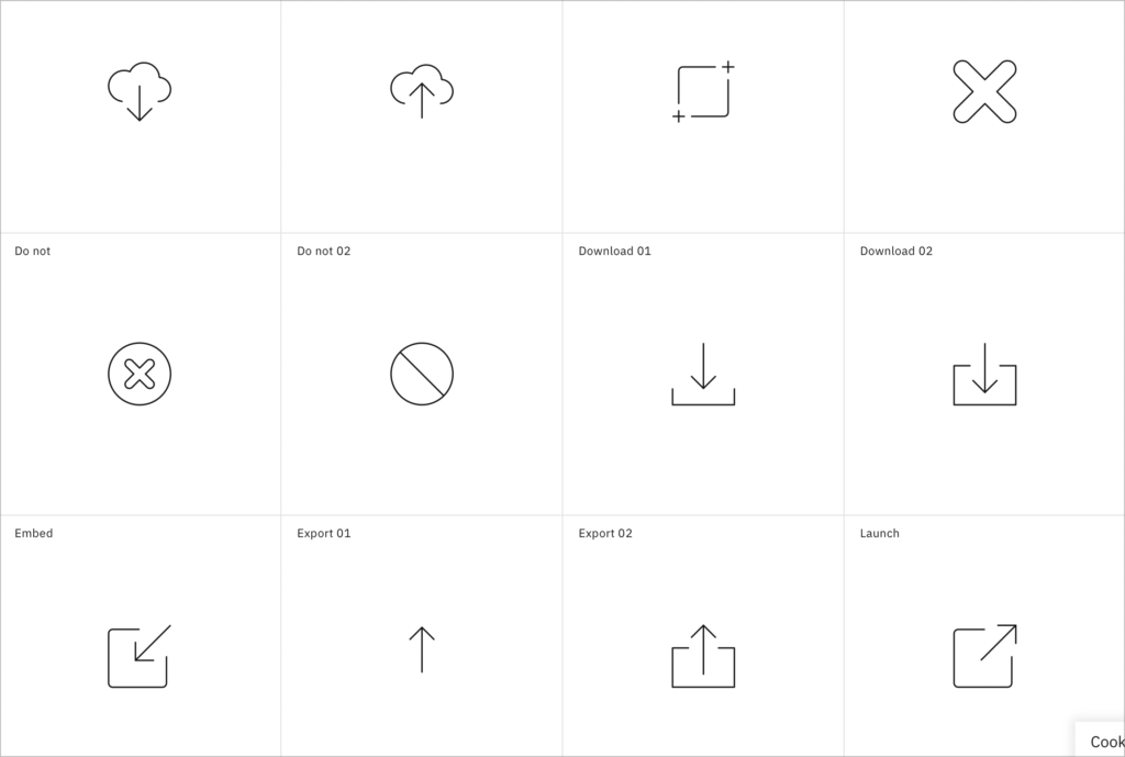
Icons
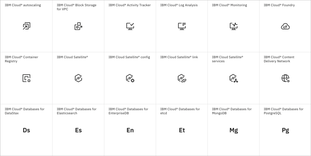
The Carbon Design System provides a treasure trove of icons to add visual interest and clarity to our digital products. No matter what concept, action or object you need represented, they’ve got it all – from people and tech-related symbols to objects galore! Plus with their organized categories system (actions, objects etc.), making sure the right icon is used for its purpose could not be simpler. Finally, these icons are designed with flexibility in mind so that customization can bring them on your product’s journey into perfection.
Pictograms
The Carbon Design System is the perfect go-to for any digital product or interface, providing a comprehensive set of pictograms that are simple and easily recognizable – saving you time when looking for just the right symbol. What’s more? These aren’t your ordinary symbols; they come with customization options so they’ll look awesome whatever size or context you need! Plus, all these little wonders have been neatly organized into categories such as actions, objects people & technology – meaning finding what fits couldn’t be easier.
Motion in this system is amazing
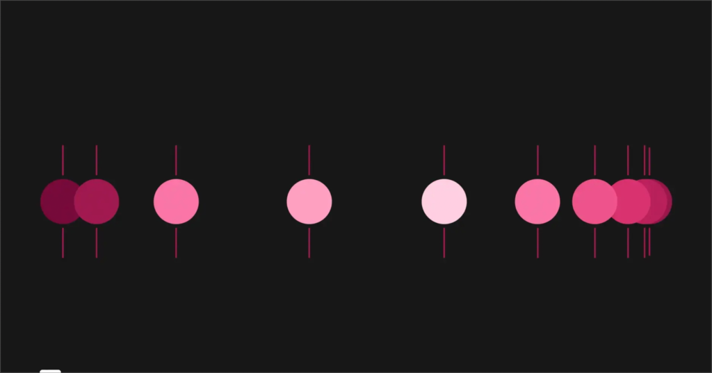
Motion plays an essential role in achieving excellent digital experiences, and the Carbon Design System has got it all figured out. With cognitive psychology and user-centered principles at its core, this system provides guidance on topics like duration, easing & acceleration – plus tips for how to use motion smartly to help users get stuff done easily or add a touch of personality!
It is worth noting that Carbon splits up its motion guidelines into two types: productive and expressive.
Carbon recognizes different types of moments in users’ experience and offers two styles of motion—productive motion, and expressive motion. The motion curves are designed to reflect the duality of man and machine.
The typography is really thoughtful
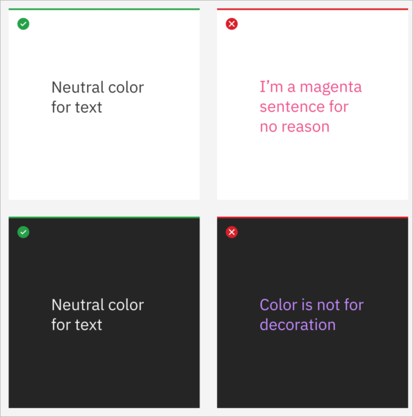
The Carbon Design System provides a host of typography tips to help designers create an effective visual hierarchy in digital products and interfaces. From font selection and readability, right through to code snippets, the guidelines provide everything you need on how best to use typeface weights, styles – all while crafting meaningful emphasis along the way! Again, Carbon splits up its things into two types: productive and expressive. This is really helpful for companies that have both a product and need solutions for marketing landers or pre login lead pages. Just amazing.
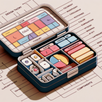
Carbon design system components
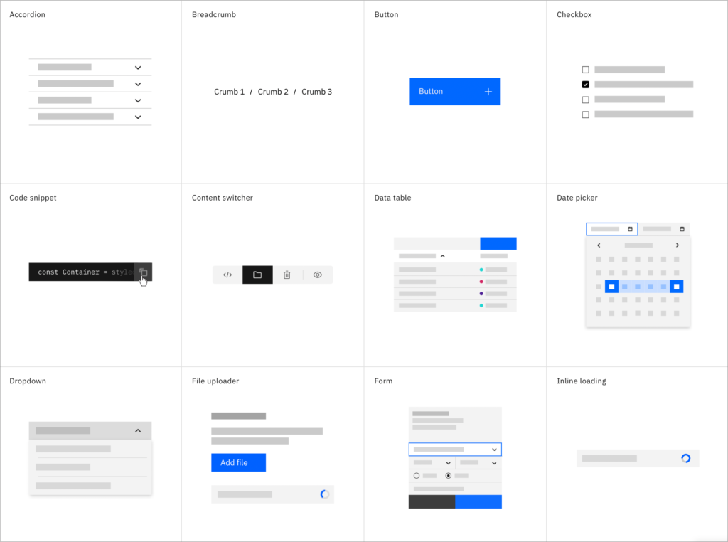
The Carbon Design System has practically everything you need to create a beautiful, intuitive user experience! From the basics like buttons and forms all the way up to more complex components such as navigation menus and data visualizations – it’s got it all. Plus, every component is designed for maximum flexibility so that they can be easily integrated into any product or design system with ease. And on top of this awesome range of UI elements? It comes equipped with detailed documentation plus code samples for each one – making your job even easier!
Read out
Carbon Design System is the ultimate go-to for teams that want great user experiences. It’s like a recipe book crafted to give your product all the necessary ingredients, from accessibilty and scalability to intuitiveness – so you can focus on what matters most: creating something truly amazing! Whether you’re a designer or developer, Carbon has everything needed to build an awesome product. We focused parts of this system, but there’s so much more to cover in future posts.