Summary: As designers, we have the opportunity to create stunning visuals that are not only aesthetically pleasing but also user-friendly. That’s why it’s so important for us to take into account all of our users, including color blind users!
Designing and building products is about caring for and understanding people. By understanding and avoiding certain color combinations which can be confusing or difficult for those affected by color blindness. As designers we are empathizing with color blind people – it’s the right thing to do.
Understanding 3 Different Types of Color Blindness
Red-green color blindness
With this condition, red and green can be tough to distinguish; so instead of seeing a variety of different hues in those shades, they look the same to the color blind.
4 types of red-green color blindness:
-
Deuteranomaly
- Greens look more red
- Mild affects
-
Protanomaly
- Red is greener as well as less bright
- Mild affects on the color blind
-
Protanopia and deuteranopia
- Both make red and green indistinguishable
Blue-yellow color blindness
This color blindness affects how the color blind see blue and green and between yellow and red.
There are 2 types of blue-yellow color blindness:
-
Tritanomaly
- Hard to tell the difference between blue and green and between yellow and red
-
Tritanopia
- Can’t perceive differences between
- blue and green
- purple and red
- yellow and pink
- Looks less bright
- Can’t perceive differences between
Complete color blindness
- can’t see color at all
- Labeled monochromacy, uncommon
- Color blind may may not see clearly
- Color blind may be sensitive to light
Designing for color blindness
The idea isn’t to avoid colors to avoid for color blind, it’s to avoid specific combinations.
One common mistake designers make is using red and green together. These colors are often used to indicate different states or actions, such as a red “error” message and a green “success” message. However, for those with red-green color blindness, these colors can appear very similar, making it difficult to distinguish between the two. Instead, designers can use other color combinations, such as blue and yellow, to indicate different states or actions.
Another color combination to avoid is purple and blue. These colors can appear very similar for those with blue-yellow color blindness. Designers can use different shades of purple or blue, or use other contrasting colors, such as orange and blue, to create a clear distinction.
Importance of High Contrast
Also, as designers we should also be careful when using low-contrast color combos, such as light gray text on a white background. These can be difficult to read for those with any form of color blindness, as well as for older adults and those with low vision.
WCAG focus areas:
- Color contrast text: font size, font color, text, text labels, form placeholders, red error messages,
- Images: patterns and textures
- Color Tools: Use contrast tools like WebAIM to help you with color accessibility for users, do not rely solely on one tool
- WebAIM: “WCAG 2.1 requires a contrast ratio of at least 3:1 for graphics and user interface components (such as form input borders). WCAG Level AAA requires a contrast ratio of at least 7:1 for normal text and 4.5:1 for large text”.
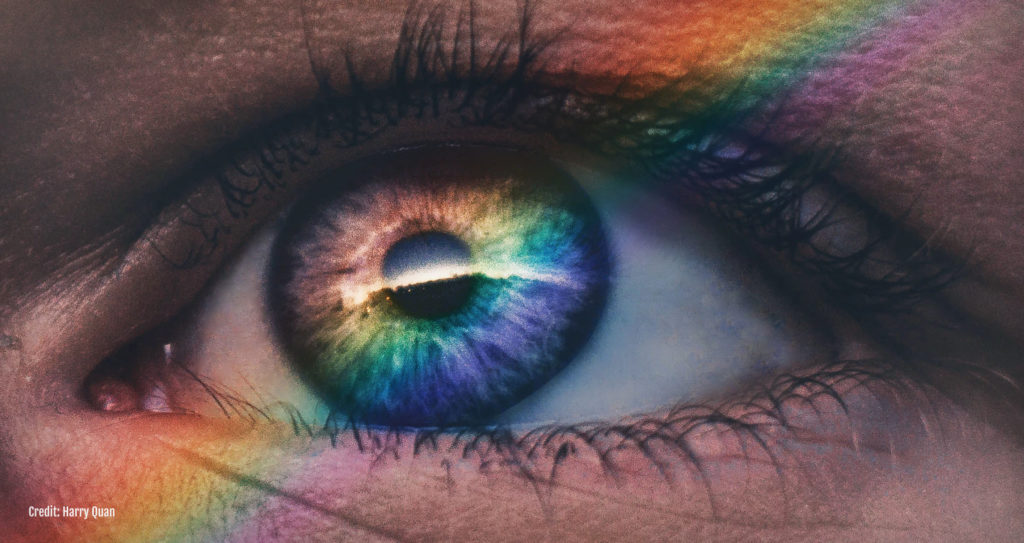
Very interesting: Color blind glasses
While researching this topic I came across an amazing product that would address the different types of color vision deficiency discussed above. Here’s the company called EnChroma:
“We’re an independent, Berkeley, California-based company that develops leading patented lens technology to improve the lives of people with color vision deficiency (color blindness). Invented by a Ph.D. glass scientist and UC Berkeley trained mathematician, EnChroma’s revolutionary color vision solutions combine the latest in color perception neuroscience and lens innovation to bring colorful possibilities to all. EnChroma received a SBIR grant from the National Institutes of Health (NIH) and earned the 2016 Tibbets Award from the U.S. Small Business Administration in recognition of the firm’s innovative impact on the human experience through technology. We offer a collection of eyewear for outdoor and indoor use in a range of modern styles for adults and kids 5+”.
“somebody with color blindness can usually only see about 10% of the normal color vision spectrum”.
It is amazing to know that the team at EnChroma dedicated themselves to bringing colors to those living with color deficiencies. ❤️
Conclusion: Color blind accessibility should be considered
Designing for the color blind may seem like an additional challenge, but it makes our designs better when more people can appreciate it. By being mindful of color combinations and contrast, designers can create products that are inclusive and accessible for all users.
It’s important to note that there are a variety of types of color blindness and this post is just an intro. There are also tools available to designers such as color blindness simulators that can help to empathize with the issues that a person with color blindness may face when using a product. There are also really cool glasses that improve the quality of life for those with color blind issues. As always, user testing with people with color blindness is crucial to ensure the design works for all people.
Color blindness accessibility source(s):
- The National Eye Institute (NEI) is part of the National Institutes of Health (NIH) and is a reliable source of information about eye health. You can visit the NEI website at https://www.nei.nih.gov/ to find more information about color blindness and other eye-related topics.
- https://enchroma.com/pages/about-us