
Introduction to a Grid system
A grid system serves as an aid for designers when building designs, helping them to create consistent user experiences and arrange information in a natural, informative manner. They utilize several common rules, including:
- Golden section
- Rule of thirds
- Modular grids
- Single column grids
- Multi-column grids
- Baseline grid systems
- Responsive grid systems
In web design, they allow for a familiar, consistent website browsing experience by assisting in aligning screen elements, working as a sort of guide or map to the website. By applying column-based structures in a consistent manner, websites become recognizable and easier to browse.
Picking the right grid system for your website can increase its performance. When people get frustrated trying to navigate a website, they tend to leave instead of trying to find what they are looking for. Depending on the purpose of your site, this can cost you valuable sales, views or subscriptions.
Grids began long ago
Grids began as a way to guide handwritten text in books, allowing writers to keep their words even and easy to read, much like lined paper does today utilizing layout grids for sections whether in a single column or multiple columns. So it wasn’t a graphic design focused practice per se, but a concept to organize parts of the page for legibility or provide order.
As writing gave way to printing, grids could serve a printer or graphic designer or typesetter as a way to manage typesetting, determining the scale and columns on the page. The industrial revolution saw an increased demand for printed works, leading to the further development of the grid system for dividing page spaces into smaller segments. This was particularly beneficial in printing advertisements, news articles and similar compilations of information printed together to allow for an intuitive flow for the reader to follow all the graphic elements on the page.
Grids grew in popularity and usage, going through several transformations and eventually being used in advertisements, packaging and even television commercials or simple ad page layout. The efficiency and order brought by grids have also been utilized for creating rows of houses in the suburbs in all mediums but especially print design. Many designers were faithfully implementing grid systems.
Credit: http://thinkingwithtype.com/grid/
The Swiss Movement of the 1940s and 1950s added a touch of modernism to grids, breaking the need for symmetry and changing how typography could influence the message conveyed in print design.
As computers quickly dominated every aspect of our lives, grid systems were quickly embraced and broke through a major challenge faced by designers. Mistakes could now be fixed with the press of a button. Elements could be dragged across the screen. As a result, experimentation grew because there was relatively little to lose compared to having to generate the grids by hand.
Types of Grid Systems
Grid systems come in three types: Fixed, fluid and hybrid. Each comes with its own pros and cons, but by and large, most people recommend using a hybrid system for best results.
Fixed Grid Systems
Fixed grid systems are among the most basic similar to modular grid. With these grids, when shrinking or expanding the website, the visible site doesn’t really change. As you shrink or expand the website, the side margins grow until breakpoints are hit.
A breakpoint is a defined point at which a website’s content adapts to try to provide a better user experience. For example, if a website has a sidebar visible in fullscreen, but the sidebar disappears when the window is minimized to half-screen to allow more of the site’s pertinent information to be viewed, a breakpoint has been hit, triggering the display to change.
This happens because the grid has fixed columns, gutters and margins defining the breakpoints. Once that threshold is crossed, the site reconfigures itself.
Fixed grid systems come with several pros and cons to consider before deciding to implement them.
Pros of Fixed Grid Systems
- Fixed grid systems with several breakpoints allow for websites to be generated for computer, tablet or phone viewing. The website stays the same across the three platforms, but the site displayed will match the screen size.
- Fixed grids allow for total control over the display of a site interface by setting fixed values for displays. Text won’t wrap and images won’t change dynamically between breakpoints.
Cons of Fixed Grid Systems
- If breakpoints are not implemented or are implemented incorrectly, smaller screens won’t get to view the entire page at one time, causing them to have to scroll horizontally, which can detract from usability and negatively impacts a viewer’s experience.
- These websites are no longer used as frequently as they once were. People have come to expect dynamic responsiveness from websites they visit, so if yours doesn’t offer that, people may not come back.
- Fixed grid systems use pixel definitions for the widths of the grid elements rather than percentage definitions, meaning even if viewed on a larger screen or higher resolution, the website will not automatically change.
Fluid Grid Systems
Fluid grid systems provide a more user-friendly interface, dynamically changing the size of the display until breakpoints trigger a change in layout different to a modular grid. Grid elements are defined by the percentage of the grid they take up, allowing them to shift as the display window shrinks or grows.
Pros of Fluid Grid Systems
- Windows change dynamically, scaling to the size of the display, which can be useful when implemented correctly.
- Displays on phones and tablets, which can come in several sizes, can be easily viewed regardless of model.
Cons of Fluid Grid Systems
- Because these screens rely on percentages, columns can get incredibly narrow on smaller screens. This can create long, narrow columns that are frustrating to read.
- It is difficult to design an interface that implements a fluid layout that looks great on both large and small screens. Large screens often look too empty while small screens look too crowded.
- Elements that should remain fixed, like images and videos, may shrink, causing issues with viewability.
Hybrid Grid Systems
Most commonly, hybrid grid systems are used in website design, taking the best of both worlds from fixed and fluid designs. Typically, sites set certain fixed sizes in pixels for specific elements, such as a footer or sidebar while allowing other content to dynamically change between breaking points.
Pros of Hybrid Grid Systems
- Combining grid system layouts can allow for a versatile, highly customizable design that takes full advantage of the dynamic nature of fluid elements while retaining the size of elements that should be fixed, like videos and images.
Cons of Hybrid Grid Systems
- Depending on the website design, some viewers may see horizontal scrollbars if their screens are smaller than the defined pixel size for fixed elements. This could pose a problem to mobile viewers on a website designed for viewing on a computer screen.
How to Implement Grid Systems
Implementing grid systems doesn’t have to be difficult. By following a few guidelines, you can get started quickly and start adding elements to your site.
Choosing the Right Grid System for Your Project
Choosing the right grid system for your project is crucial to developing an effective website. In most cases, a hybrid system is probably best, but you may benefit from some of the pros or cons of the fixed or fluid systems.
Additionally, consider whether you need column, modular or hierarchical grid design. This will be based on the purpose of your website. A hierarchical grid works well, for example, with news platforms. A modular or column grid may be more suitable for displaying highly variable content, such as ecommerce. because they offer plenty of flexibility while designing your site.
Setting Up the Grid System in Your Design Software
Setting up a grid requires a few steps, but once you get the hang of it, it flows quickly. Once you know what kind of grid you want, you can then start setting it up. The exact method to do so will vary based on the software you use, but the steps to setting up and implementing the grid remain the same.
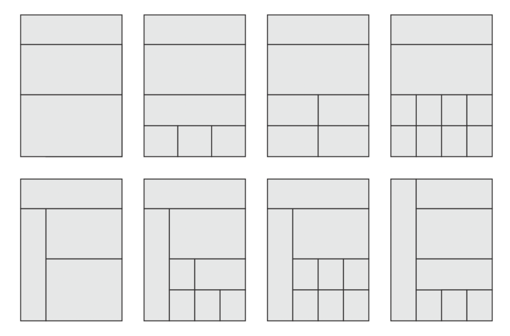
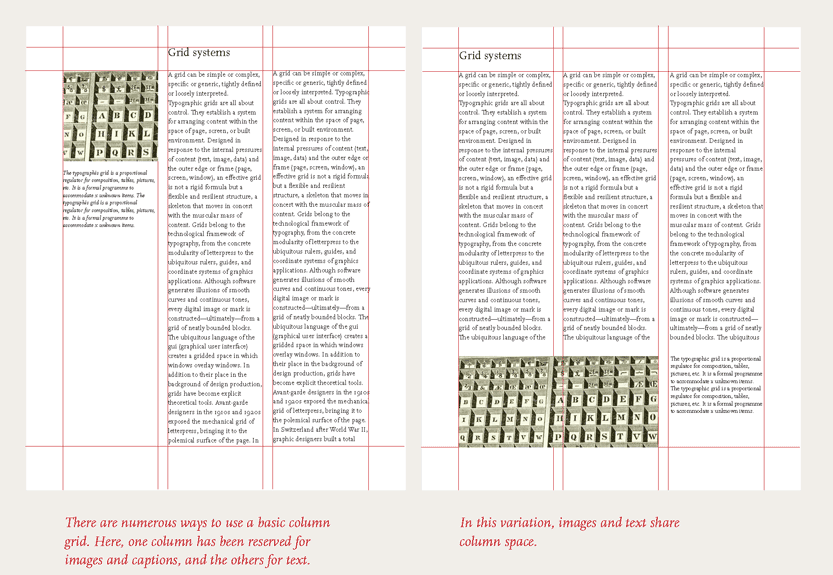
Grid system layout examples
Begin by determining how many columns you need and decide on the margin and gutter sizes. It’s a good idea to do this for desktop, tablet and mobile viewing so your website can be viewed on any system. Use this information to create the grid.
Once the grid is in place, make sure content is always placed within the columns rather than the gutters. This means your website elements should align on both the left and right side with columns.
Tips for Working with Grid Systems
To help work with grid systems, consider these tips to streamline the process.
Follow Responsive Designs
Most websites benefit from some degree of fluidity by allowing for websites to have dynamically changing elements. This causes the tiles and grid content to scale with the size of the display and keeps the information hierarchy intact so your website still has an intuitive flow to it, no matter the screen size.
Pay Attention to White Space
White space assists with keeping website content readable and organized. Make sure the width and height between columns and rows allow for the grid to adjust.
Use the Golden Ratio and Rule of Thirds
Both the Golden Ratio and Rule of Thirds can boost the aesthetic of a web design. The Golden Ratio enhances the layout, balance and sizing, drawing from the Fibonacci sequence. The length of design elements should be 1.6180 times the width.
Using the Rule of Thirds assists in designing a grid that appears visually balanced. This requires you to divide your webpage with a 3×3 grid to create nine boxes that are the same size and assists in placing elements within them.
Best Practices for Using Grid Systems
When using your grid system, there are several practices that can help you design an attractive website that keeps visitors returning. The primary considerations are alignment and consistency, hierarchy and contrast, and responsive design.
Alignment and Consistency
Alignment in web design refers to the positioning of all elements. They may be left, right, center or justified. By properly aligning your site, you can create a sense of structure and consistency. Alignment will impact text, images and groups of elements.
Choosing the correct alignments can dramatically influence the feel of a website. Remember the Rule of Thirds, the Golden Ratio, and keep elements in the columns of your grid rather than in the gutters.
Regardless of the method you choose to align your site, do so consistently across your web pages to create a cohesive experience.
Hierarchy and Contrast
Hierarchy refers to the order in which elements are presented to guide them through your site. You want the most important elements to be viewed first. The hierarchy of information is created by using both size and scale to guide the viewer’s focus. Likewise, contrast and color used in tandem can help draw attention to important elements. Contrast, especially with bright colors, can help draw attention to focal points. This can be used with website navigation to draw attention to elements you want your viewers to focus on.
Responsive Design Considerations
Responsive designs are more important than ever when so much web browsing happens on mobile devices. Breakpoints will scale the site based on the device viewing it, allowing the layout to adjust to phones, tablets and desktops, regardless of resolution.
Before designing a responsive site, there are a few important considerations:
- Begin with the mobile site first. It is easier to scale up from a mobile site to a desktop site than it is to shrink a desktop site down.
- Create fluid images and grids that will automatically scale on larger screens.
- Use Scalable Vector Graphics when creating 2D graphics to avoid the image appearing pixelated on a larger screen.
- Use three or more breakpoints.
- Aim for accessibility and minimalism.
- The design should be focused on ease of use to develop familiarity.
Conclusion
Grid systems have guided our ability to display large amounts of information in an intuitive way, and they will continue to do so long into the future. Understanding how to implement grid systems in your web design will be one of the most valuable contributions you can make. Effectively using grid systems is all about following the rules of design while still creating a unique, inviting experience for viewers.
To keep learning more, consider checking out classes and guides for the design software you are using. These are often some of the most useful sources of information, as they will apply specifically to your software and guide you through the process of using it to create vivid, eye-catching designs.
Here are resource links about grid systems:
- Interaction Design Foundation: “Grids Systems” – https://www.interaction-design.org/literature/topics/grid-systems
- “Are grid systems still relevant in digital product design?” – https://medium.com/subform/are-grid-systems-still-relevant-in-digital-407beb4128c1
- Designmodo: “Grid Systems” – https://designmodo.com/grid-systems/
- DESIGNLAB: “The Grid System: Importance of a Solid UX/UI Layout” – https://designlab.com/blog/grid-systems-history-ux-ui-layout/
- Thinking with type: http://thinkingwithtype.com/grid/