Home / Design Blog / iOS 7 icons too flat?

iOS 7 icons too flat?

By: Simon
Updated:
Jul 24, 2013
Posted: Jul 24, 2013

Good short read, interesting thoughts on how iOS 7 icons may or may not be too flat. Personally, I like flat design. It’s not anything new perse, but like everything use in moderation. Read below:

ios7-flat-vs-gloss-hero

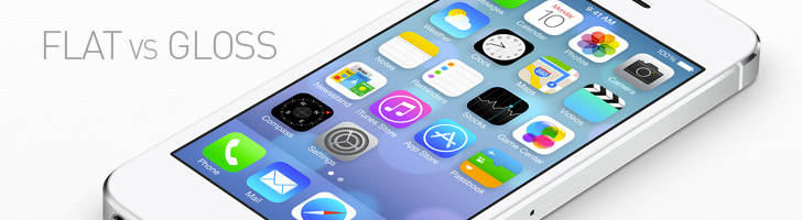
iOS 7′s new icons have certainly generated mixed reactions, from the fiery hate of a thousand suns to endless coos over the flat design trend. Read More

Simon Urbina

Simon Urbina

Simon is a Product Designer and Front End Dev with over 20 years of experience. He started as a graphic designer and illustrator coding his first website in 1996. He has worked with brands like Publix, Microsoft, and Discovery Channel.